Shapes play a powerful yet often overlooked role in branding.
They influence how your audience feels and how they interpret your message.
Whether you design your own graphics or collaborate with a designer, understanding the psychology of shapes can help you create a brand that feels intentional, aligned, and true to your business personality.
Many entrepreneurs and creative business owners focus on colours and typography first, while shapes remain an afterthought.
Yet shapes guide the energy of your brand.
When you understand the emotional language behind them, you gain the ability to design visuals that speak clearly and support your business goals.
The more grounded your understanding of shapes becomes, the more confident you will feel choosing logos, layouts, icons, and graphic elements.
Below is a guide on what shapes mean in digital marketing, and how you can use them to your advantage.
Circles and Curves Create Warmth and Approachability
Circular shapes communicate softness, connection, and inclusiveness.
They feel natural and organic, which is why so many wellness, lifestyle, and creative brands use curves in their logos or patterns.
Circles create a sense of flow and movement without sharp edges, which helps your audience feel more at ease when interacting with your content.
- Why it works: They suggest that your business is approachable and people centred. Curved shapes reduce visual tension and evoke a sense of fluidity, unity, and openness.
- How to use it: Add circular frames, soft rounded lines, or curved icons to your graphics. Use arcs or circles in your logo or in subtle background elements. Keep the design simple to maintain clarity.
- Pro tip: Pair curves with warm tones or gentle gradients to strengthen the sense of approachability.
Squares and Rectangles Convey Structure and Reliability
Squares and rectangles are associated with stability, strength, and clarity.
These shapes create order and a sense of precision, which helps your brand appear trustworthy and professional.
When used with intention, they support a clean and minimal aesthetic that communicates confidence and dependability.
These shapes are especially helpful for coaches, consultants, and service providers who want to communicate a reliable and structured approach.
- Why it works: Angular shapes create a visual sense of balance and control, which strengthens your audience’s trust in your expertise.
- How to use it: Use rectangular containers in your layouts, structured frames for your images, or square icons for consistency. Maintain equal spacing to reinforce organisation.
- Pro tip: They work well in grid layouts, content templates, web design sections, and portfolio presentations.
Triangles and Dynamic Shapes Add Energy and Direction
Triangles and directional shapes introduce movement and momentum into a brand.
They can create a sense of ambition, progression, or innovation.
These shapes often feel more bold and expressive, making them ideal for brands that want to communicate forward thinking energy or a transformative experience.
Upward pointing triangles often represent aspiration or growth. Sideways triangles suggest movement, transition, or guidance.
When used strategically, triangles help create visual paths that guide your audience’s eyes through your content.
- Why it works: Directional shapes activate visual movement and signal progression, which can energise and motivate your audience.
- How to use it: Use small triangular accents to guide attention toward important elements. Consider subtle directional shapes in your logo or patterns if your brand wants to highlight growth or transformation.
- Pro tip: Because triangles feel energetic, use them sparingly if your brand leans minimalist. A few intentional accents can have more impact than bold patterns.
You might also enjoy these posts:
- Five Practical Ways to Stay Visually Consistent Across All Platforms
- Fonts, Colours, and Shapes: The Trio That Builds Brand Trust
- 3 Simple Layout Tricks to Upgrade Your Social Posts
Mood Board Inspiration for Funky Layouts
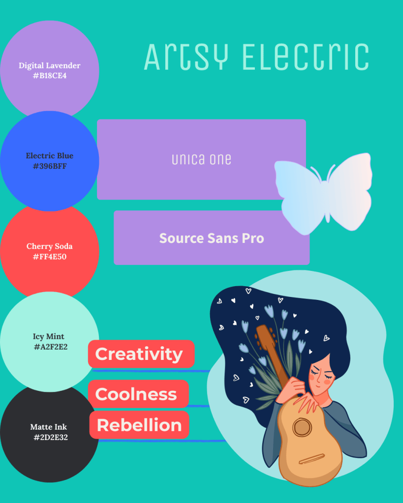
- Digital Lavender or Matte Ink for backgrounds
- Cherry Soda and Electric Blue as eye-catching accents
- Icy Mint for a fresh, unexpected pop
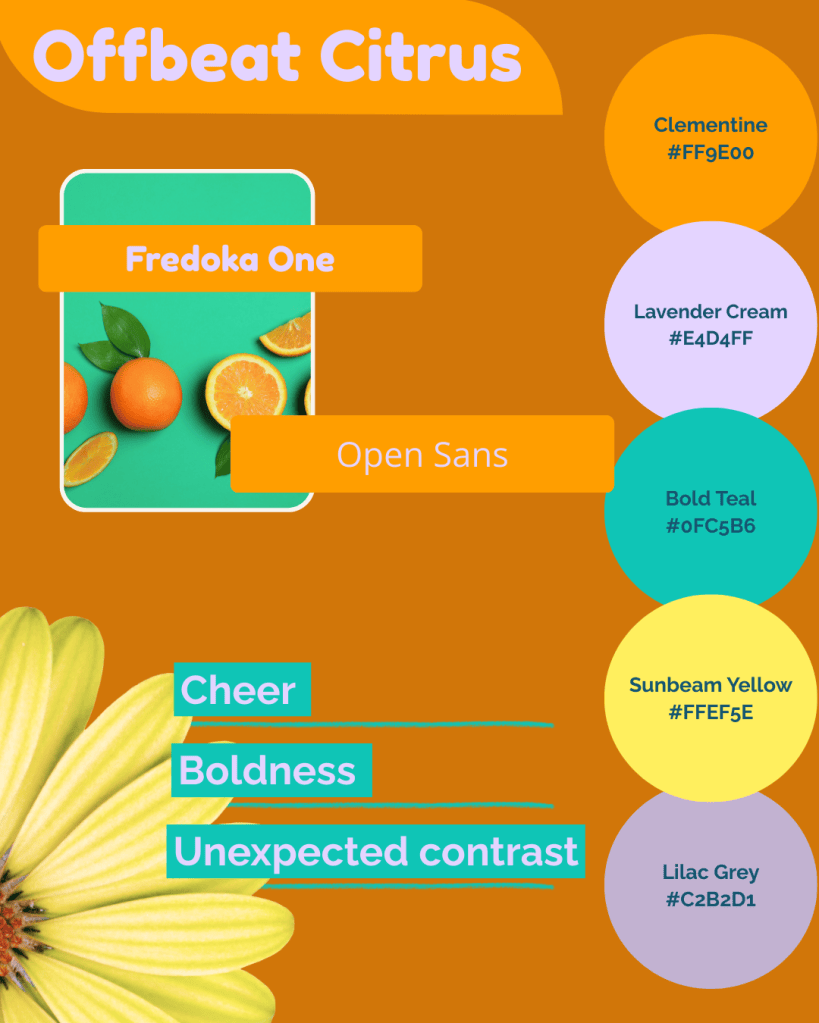
- Clementine anchors your palette
- Lavender Cream and Lilac Grey soften the energy
- Bold Teal and Sunbeam Yellow make highlights pop
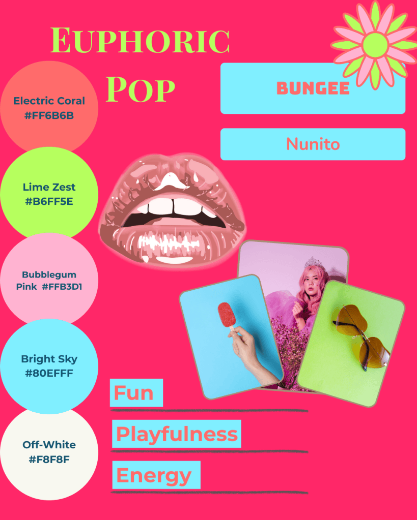
- Electric Coral and Lime Zest for excitement
- Bubblegum Pink and Bright Sky for playful accents
- Off-White balances the palette and keeps it readable
Bringing It All Together
At Simatrix Digital Studio, we can create custom mood boards, social templates, and ready-to-go content kits that take the uncertainty out of layout and design.
Whether you prefer a DIY approach with editable templates or a completely tailored solution, our tools make it easy to maintain a professional, cohesive, and on-brand presence.
Shapes form the unseen structure of your visual identity.
They influence how your audience feels the moment they encounter your brand and shape the expectations they carry into your content.
Small, intentional choices create a cohesive brand that feels aligned, recognisable, and true to your business values.
Want help shaping a brand identity that feels intentional from every angle? Visit the Simatrix Digital Studios website to see how we can help.
