
Building a recognisable visual identity is one of the simplest ways to strengthen your brand presence across every channel you use.
Whether you are creating content for Instagram, updating your website, or preparing a PDF guide for clients, consistency helps people connect your work to your business at a glance.
It creates a sense of trust, professionalism, and familiarity, which is something every growing brand needs.
The challenge is that many small business owners and creative entrepreneurs juggle multiple platforms without a clear structure.
This often leads to mismatched colours, uneven design choices, or content that feels disconnected from the brand’s personality.
When this happens, your marketing works harder than it should, and your visual identity loses its clarity. With the right systems, you can maintain a cohesive look across social media, your website, newsletters, and digital products.
The following five methods will help you strengthen your visual identity and create a more unified experience for your audience.
1. Create a Clear Colour Palette
A defined colour palette removes guesswork and brings cohesion to everything you design.
It ensures your brand feels familiar from one platform to the next, no matter the format.
When you use a consistent palette, you reduce visual noise and help your audience recognise your posts instantly.
- Why it works: A consistent palette builds recognition and strengthens your brand’s emotional tone.
- How to use it:
- Choose three to five core colours and two accent tones.
- Add the hex codes to your design tools and use them as your default across social media, your website, and digital products.
- Tools like Canva make it easy to save and apply your brand colours consistently, while websites like Coolors can help you explore complementary shades and generate palettes quickly.
- Pro tip: Create a simple mood board that shows your colours in use. This helps you stay aligned and gives you a visual reference when creating new content.
2. Use a Small, Defined Set of Fonts
Typography shapes the personality of your brand more than most realise.
A curated set of fonts keeps your brand voice steady and avoids designs that appear scattered.
When you commit to one primary typeface and one or two supporting styles, you create a seamless visual rhythm across your platforms.
- Why it works: Consistent typography creates harmony, enhances readability, and quickly signals your brand identity.
- How to use it: Select one primary font for headings and one for body text. Use them across your website, social media graphics, email templates, and downloadable resources.
- Pro tip: Save pre-designed title and text styles in Canva or your preferred design platform. This keeps your formatting uniform and prevents accidental style drift.
3. Establish Repeatable Layout Styles
Layout patterns are one of the strongest tools for creating visual consistency.
When your posts, pins, banners, or blog graphics follow a similar structure, your audience begins to recognise your work even before reading your name.
Consistent layouts also save you time since you are not starting from scratch each time you design something new.
Repeatable layouts are especially useful for Instagram, Pinterest, and blog covers, where visual recognition directly affects performance.
- Why it works: By using a core set of layouts, you create a clear sense of continuity across your content.
- How to use it: Choose three to five layout styles. Use them for carousel covers, quote posts, reels covers, Pinterest pins, or blog graphics. Rotate them regularly but do not deviate from the set.
- Pro tip: If you want extra refinement, create a layout guide that lists spacing rules, image placements, and text alignment.
You might also enjoy these posts:
- How Fonts, Colours, and Shapes Build Brand Trust for Small Businesses
- How to Pick the Right Mood Board for Your Brand Type
- Make Your Brand Look and Feel Aligned
Mood Board Inspiration for Funky Layouts
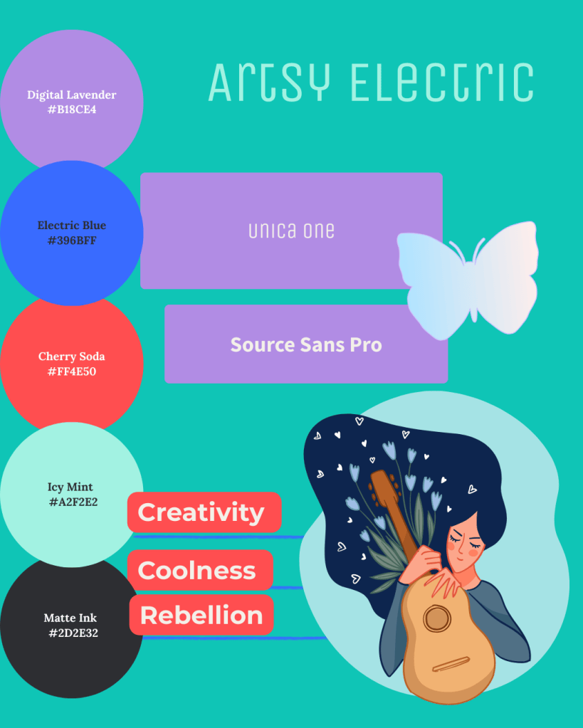
- Digital Lavender or Matte Ink for backgrounds
- Cherry Soda and Electric Blue as eye-catching accents
- Icy Mint for a fresh, unexpected pop
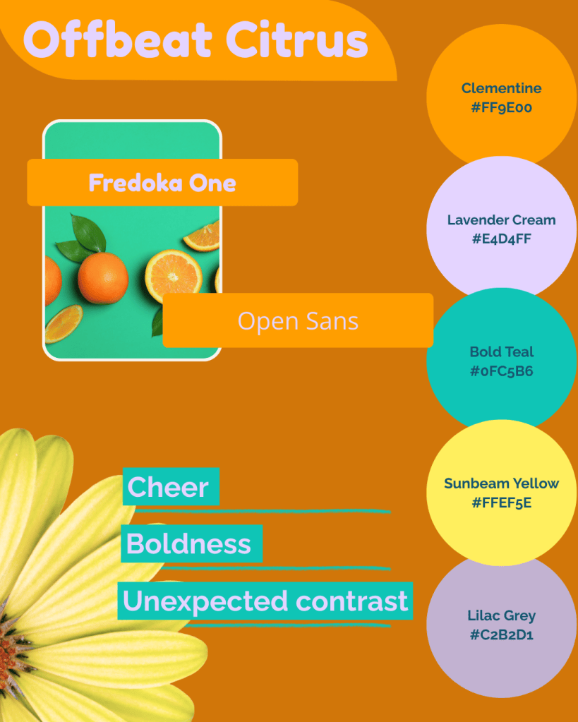
- Clementine anchors your palette
- Lavender Cream and Lilac Grey soften the energy
- Bold Teal and Sunbeam Yellow make highlights pop
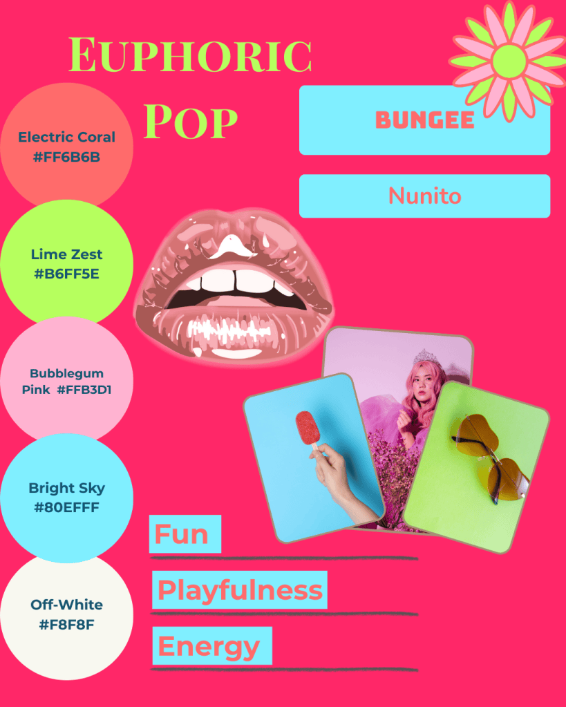
- Electric Coral and Lime Zest for excitement
- Bubblegum Pink and Bright Sky for playful accents
- Off-White balances the palette and keeps it readable
Quick Tips to Apply These Ideas
- Stick to three to five colours for all design work.
- Use two or three fonts across all platforms for clarity and consistency.
- Save your layouts as templates so you always have reliable starting points.
Bringing It All Together
At Simatrix Digital Studio, we can create custom mood boards, social templates, and ready-to-go content kits that take the uncertainty out of layout and design.
Whether you prefer a DIY approach with editable templates or a completely tailored solution, our tools make it easy to maintain a professional, cohesive, and on-brand presence.
Visual consistency is about creating a dependable experience for your audience
When your posts, pages, and graphics all reflect the same identity, your brand feels more confident and intentional.
These small, steady choices build recognition over time and help your business look polished across every platform you use. With a few simple systems in place, your visual identity becomes a powerful tool that supports your growth.
Want help building a visual identity that feels consistent everywhere it shows up? Visit the Simatrix Digital Studios website to see how we can help.
