3 Simple Layout Tricks to Upgrade Your Social Posts
Every scroll, swipe, and double-tap tells a story about your brand (often before anyone reads a single word!).
The layout of your posts communicates professionalism, personality, and attention to detail.
Many entrepreneurs and creatives struggle with making their content feel consistent and visually engaging.
Even small adjustments in spacing, alignment, and hierarchy can transform your posts from “meh” to memorable.
This guide walks you through three simple layout tricks that can upgrade your social media presence without overwhelming your schedule.
1. Master the Grid
Using a clear grid structure is one of the easiest ways to make your posts look polished and cohesive.
- Why it works: A grid creates visual balance and guides the viewer’s eye naturally.
- How to use it: Divide your canvas into thirds or quarters. Align text, images, and icons along these invisible lines.
- Pro tip: Keep spacing consistent between elements — margins and padding make a huge difference.
Even subtle alignment changes make your brand look organised and intentional. Templates with built-in grids can save time and ensure consistency across all posts.
2. Emphasise Hierarchy
Hierarchy directs attention and tells your audience what matters most in your message.
- Why it works: Not all text is equal — headings, subheadings, and body text should clearly communicate importance.
- How to use it: Make headlines bold or larger than supporting text. Use secondary fonts or colours to highlight key points.
- Pro tip: Combine a strong primary font with a simple secondary font to create contrast without clutter.
A post with clear hierarchy is easier to read and more likely to engage viewers quickly as they scroll.
3. Balance Text and Visuals
Your posts shouldn’t feel crowded, but they also shouldn’t feel empty. Finding the right balance makes your content feel approachable and professional.
- Why it works: Balanced layouts are more visually appealing and improve readability.
- How to use it: Pair images or illustrations with concise text. Leave enough whitespace around elements to avoid a cluttered feel.
- Pro tip: Use recurring shapes, icons, or colour blocks to tie posts together and reinforce your brand identity.
Whitespace is your friend. Strategic use of empty space makes your content feel calm, organised, and intentional.s.
You might also enjoy these posts:
- How Bold Colours Can Help You Stand Out
- Design Your Brand Personality with Joyful & Grounded Mood Boards
- Make Your Brand Look and Feel Aligned
Mood Board Inspiration for Funky Layouts
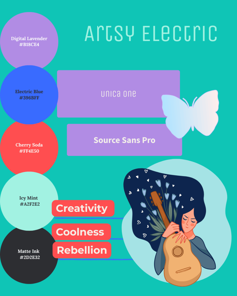
- Digital Lavender or Matte Ink for backgrounds
- Cherry Soda and Electric Blue as eye-catching accents
- Icy Mint for a fresh, unexpected pop
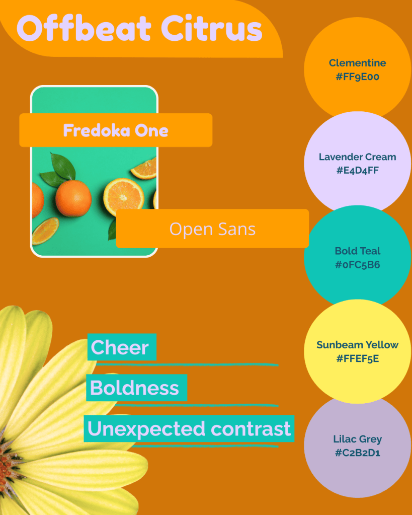
- Clementine anchors your palette
- Lavender Cream and Lilac Grey soften the energy
- Bold Teal and Sunbeam Yellow make highlights pop
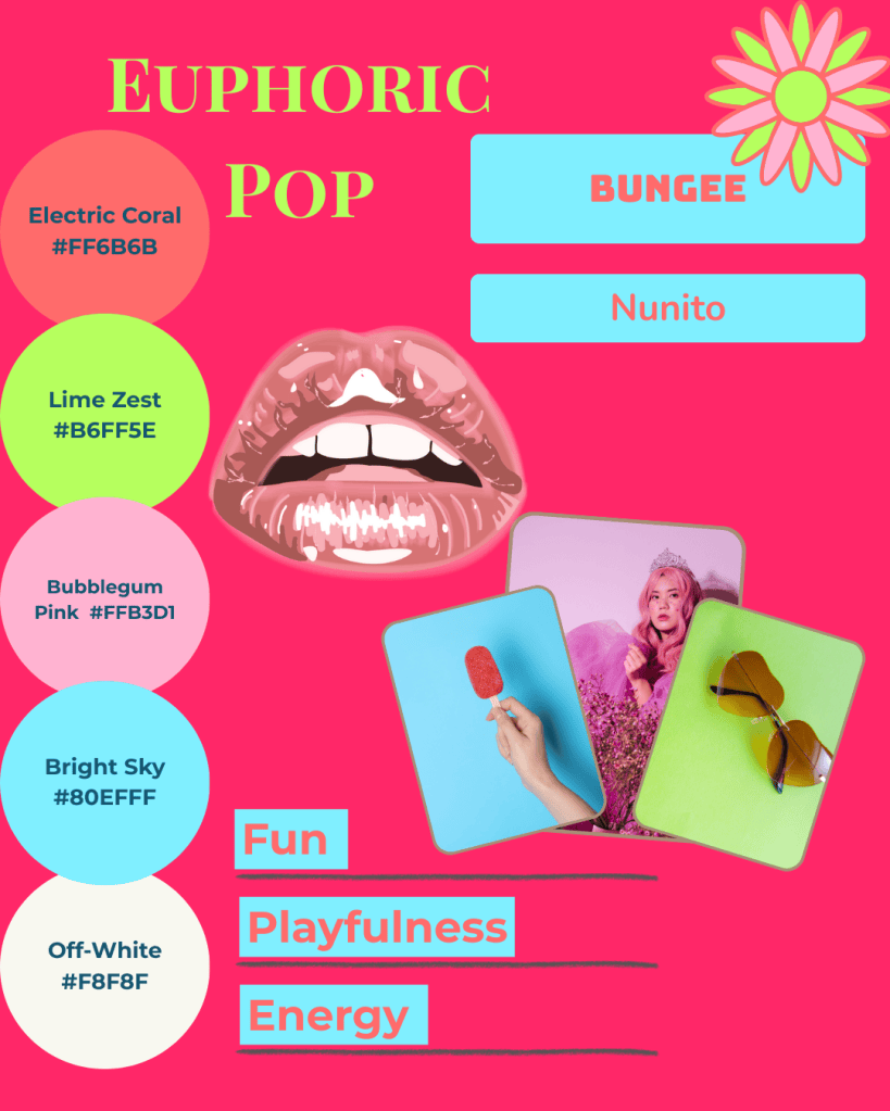
- Electric Coral and Lime Zest for excitement
- Bubblegum Pink and Bright Sky for playful accents
- Off-White balances the palette and keeps it readable
Quick Tips to Apply These Tricks
- Start with Templates
Pre-designed layouts reduce decision fatigue and ensure consistency. - Stick to Your Brand Palette
Consistent colours, fonts, and styles make your posts instantly recognisable. - Test on Mobile First
Most viewers scroll on their phones. Ensure text is legible and visuals look balanced on smaller screens.
Bringing It All Together
At Simatrix Digital Studio, we can create custom mood boards, social templates, and ready-to-go content kits that take the uncertainty out of layout and design.
Whether you prefer a DIY approach with editable templates or a completely tailored solution, our tools make it easy to maintain a professional, cohesive, and on-brand presence.
Small layout tweaks have a big impact.
With the right grids, hierarchy, and balance, your social media posts will feel polished, professional, and aligned with your brand thus capturing attention and building trust with every scroll.
Want help creating layouts that feel effortlessly on-brand? Visit the Simatrix Digital Studios website to see how we can help.
