The Art of Font Pairing
Fonts aren’t just about letters on a page. They communicate mood, style, and personality.
The way you pair typefaces can make your brand feel professional, approachable, playful, or sophisticated, often before anyone reads a single word.
When done right, font pairing strengthens your brand’s visual identity, ensures consistency, and helps you stand out in a crowded market.
For busy entrepreneurs, coaches, and creatives, knowing how to combine fonts can save time, reduce design stress, and make your content feel cohesive across platforms.
Why Font Pairing Matters
A single font rarely carries the full story of your brand. By combining fonts thoughtfully, you can:
- Create cohesion: Consistent type combinations unify your website, social media, and marketing materials.
- Highlight hierarchy: Different fonts guide the reader’s attention from headings to body text and accents.
- Reinforce personality: Fonts convey tone and mood — friendly, bold, calm, or luxurious.
Key Principles for Font Pairing
Pair Contrasting Styles
Combine fonts that complement each other without competing. For example:
- Display + Minimal: A bold header with a clean body font balances creativity and clarity.
- Serif + Sans-serif: Classic meets modern, creating elegance and readability.
- Script + Sans-serif: Adds personality while keeping text legible.
Limit Your Palette
Stick to 2–3 fonts to keep your brand consistent and professional. Overloading with multiple typefaces can feel chaotic and dilute your brand personality.
Consider Readability First
No matter how stylish a font is, it must be legible on all devices. Test your pairings in headings, body text, social posts, and downloadable resources.
Mood Board Examples for Font Pairing
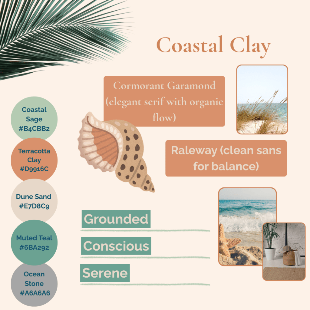
- Mood & Feel: Reliable, serene, professional
- Ideal For: Coaches, consultants, wellness brands
- Use: Convey stability and trust across all brand materials
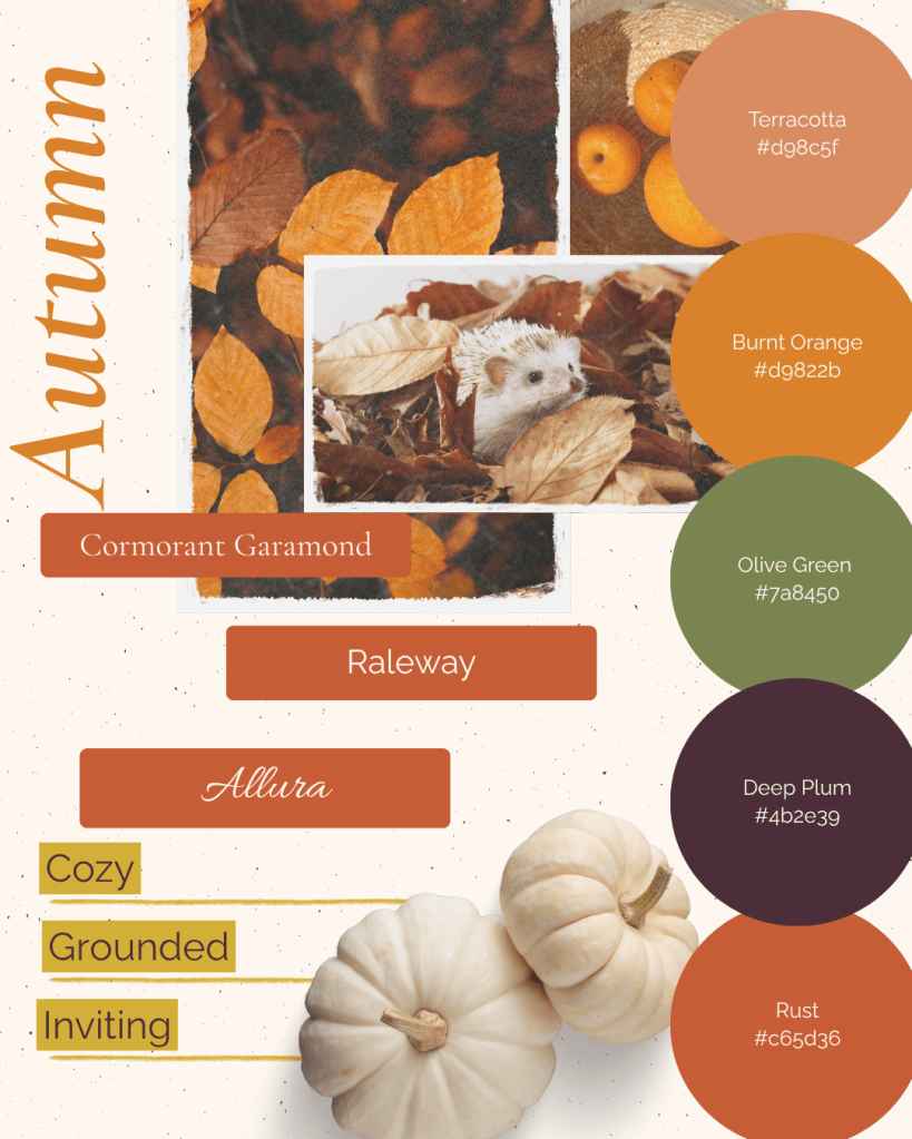
- Mood & Feel: Warm, approachable, cozy
- Ideal For: Boutique businesses, seasonal campaigns
- Use: Highlight promotions, seasonal content, or product launches
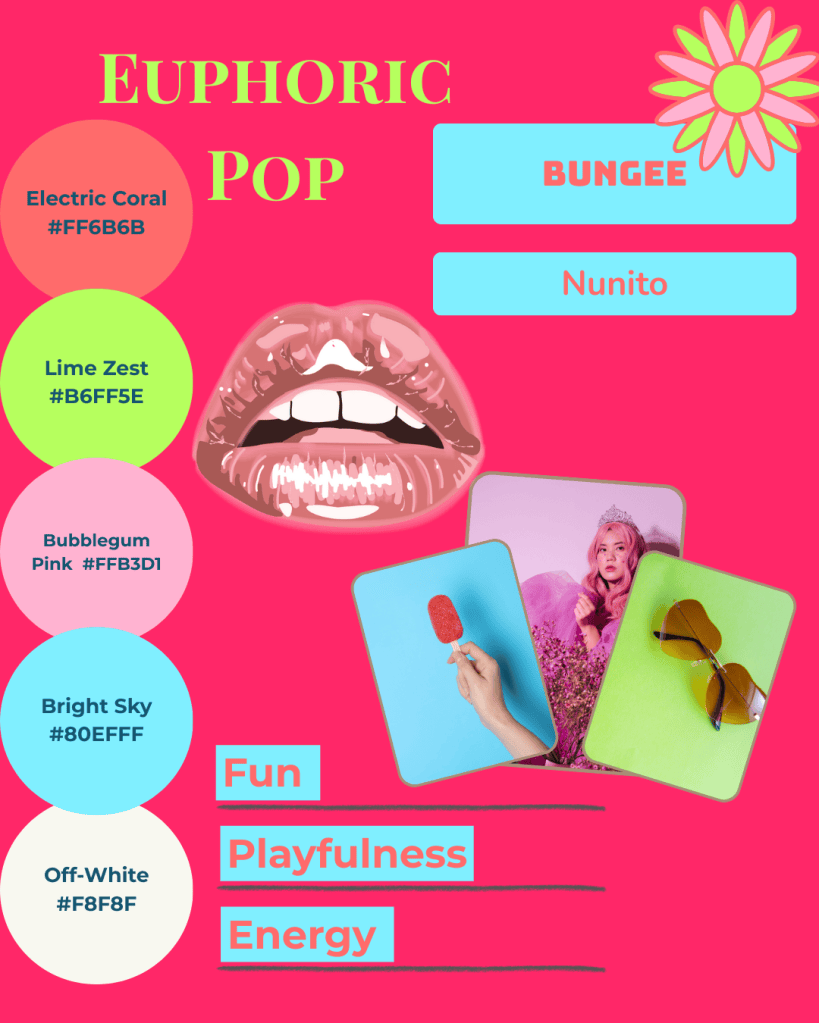
- Mood & Feel: Energetic, fun, memorable
- Ideal For: Creative agencies, lifestyle brands
- Use: Make headings and key messaging pop without overwhelming
You might also enjoy these posts:
- How to Choose the Right Fonts for Your Brand Personality
- Design Your Brand Personality with Joyful & Grounded Mood Boards
- 3 Simple Layout Tricks to Upgrade Your Social Posts
Practical Steps to Apply Font Pairing
- Start with Your Brand Values
Identify the tone you want your brand to communicate: calm, bold, creative, professional, or playful. - Choose a Primary and Secondary Font
- Primary: Used for headers, logos, or prominent design elements.
- Secondary: Used for body text, captions, and supportive content.
Optional Accent Font: For callouts, quotes, or decorative elements.
- Test Across Platforms
Check readability and aesthetic consistency on your website, social media, email templates, and print materials. - Document Your Pairings
Create a simple style guide or template kit to keep your fonts consistent across your team and future projects.
Bringing It All Together
At Simatrix Digital Studio, we can create a custom font pairing and mood board for your brand , or you can explore our editable templates and social media kits on Etsy.
These resources make it simple to implement cohesive, professional, and personalised fonts across all your visual content.
The right font combinations don’t just make your brand look polished:
It’s an easy way to help your audience understand and connect with your brand personality at a glance. With carefully paired typefaces, your brand can feel confident, cohesive, and completely authentic.
Want help pairing fonts that feel authentically you? Visit the Simatrix Digital Studios website to see how we can help.
