How to Choose the Right Fonts for Your Brand Personality
Fonts are a key part of your visual identity.
They send signals about your brand personality before anyone reads a single word. The right fonts make your brand feel approachable, professional, playful, or luxurious (depending on your business goals).
Choosing fonts thoughtfully ensures that your visuals are consistent, memorable, and aligned with your messaging.
For entrepreneurs, small business owners, coaches, and creatives, understanding how fonts work can help you build a brand that truly reflects who you are.
How Fonts Reflect Brand Personality
Different fonts carry distinct vibes and associations. Here are the most common categories:
- Serif Fonts: Classic, trustworthy, and sophisticated. Think brands that want to convey professionalism or timeless elegance.
- Sans-Serif Fonts: Modern, clean, and approachable. Great for brands seeking clarity, minimalism, and friendliness.
- Script & Handwritten Fonts: Personal, creative, and expressive. Best used sparingly to add warmth or personality.
- Display & Decorative Fonts: Bold, playful, and memorable. Ideal for standout headings, logos, or creative ventures.
When selecting fonts, consider not only aesthetics but also readability, tone, and how the font works across multiple platforms (website, social media, marketing materials, print).
How to Choose Fonts for Your Brand Personality
Start with Your Core Values
Identify the emotions and traits your brand embodies: trust, creativity, professionalism, warmth, or energy. Your fonts should reflect these values consistently.
Pair Fonts Strategically
Most strong brand identities use 2–3 fonts maximum. A common approach:
Optional Accent Font: Used sparingly for highlights, callouts, or quotes.
Primary Font: For headings and major design elements.
Secondary Font: For body text, captions, or supportive content.
Test for Readability and Versatility
Make sure your fonts are legible on different screens and devices. Check how they appear in various sizes and against your brand colours. A font may look stunning in a mood board but feel crowded or hard to read on social media posts.
A simple trick: zoom out as much as possible (or view your design at a smaller size in Canva) to see if your text remains readable — if it’s hard to read when scaled down, adjust the size, weight, or spacing.
Consider the Mood and Feel
Fonts should complement your brand’s tone:
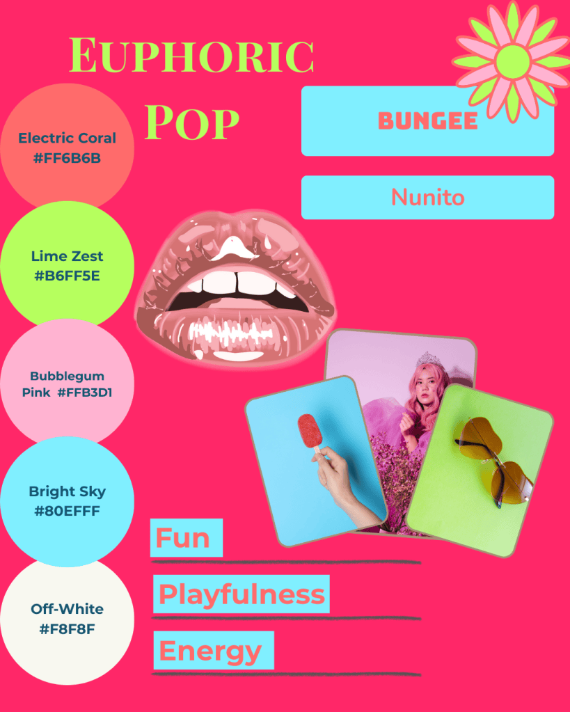
A creative studio might pair a bold display font with a minimal sans for energy and clarity.
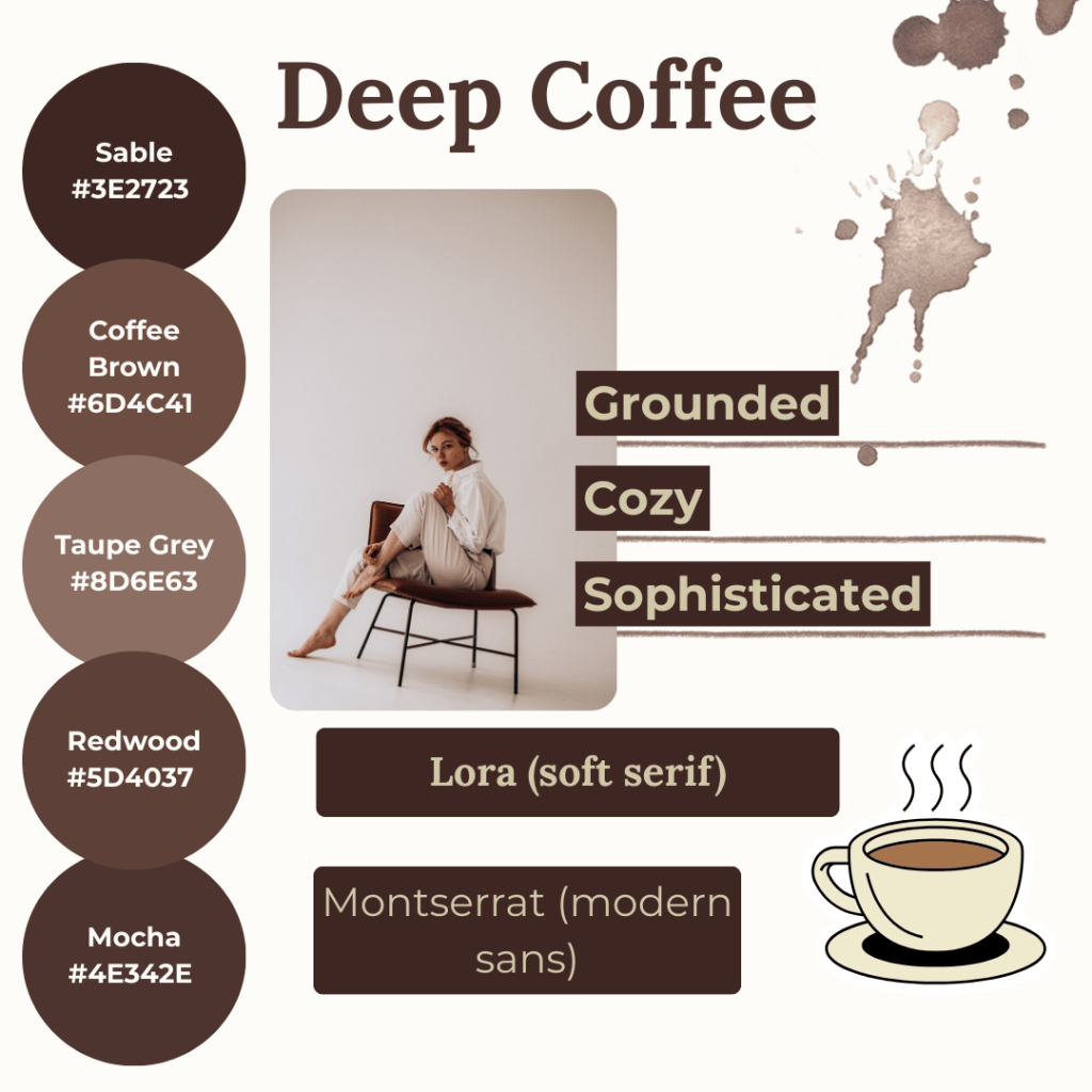
A wellness coach might combine a soft serif with a clean sans for calm and trust.
Mood Board Ideas for Fonts
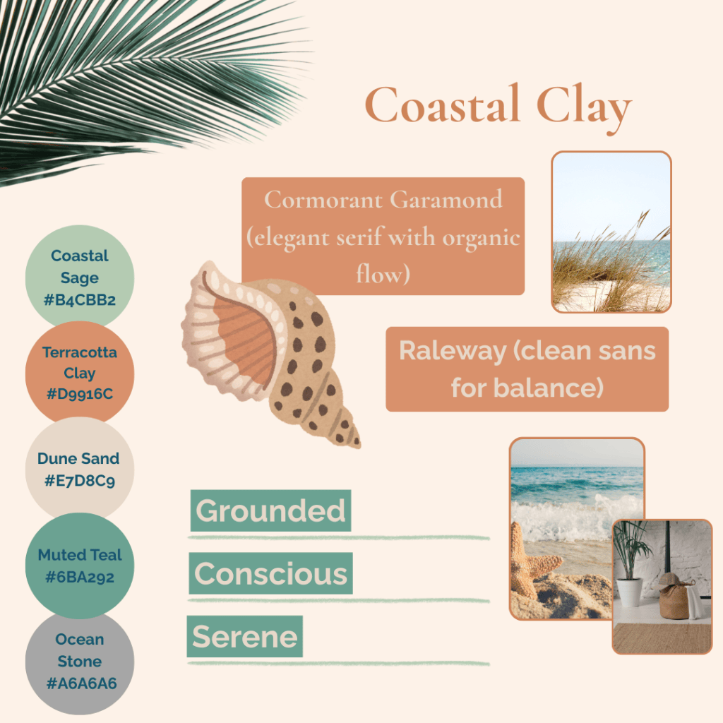
Here are three examples of brand font moods that illustrate personality and tone:
You might also enjoy these posts:
- How to Find Your Brand with Colour Psychology
- Design Your Brand Personality with Joyful & Grounded Mood Boards
- Make Your Brand Look and Feel Aligned
Bringing Fonts Into Your Brand System
Consistency is key. Once you’ve chosen your fonts:
- Apply them across your website, social media, and marketing materials.
- Create a simple brand guide to ensure you and your team use fonts correctly.
- Combine fonts with your colour palette and imagery to strengthen brand recognition.
Remember, fonts aren’t just about aesthetic: they communicate your brand story.
When paired thoughtfully with colours and visuals, your typography reinforces your personality and builds trust with your audience.
At Simatrix Digital Studio, we can create a custom mood board for your brand, or you can use our editable templates and social media kits on Etsy to bring these fonts to life yourself.
Choosing the right fonts doesn’t just make your brand look professional but also helps your audience feel confident in who you are and what you offer.
With the right typefaces, your brand can be approachable, memorable, and uniquely yours.
Want help choosing fonts that feel like your brand? Visit the Simatrix Digital Studios website to see how we can help.
