How to Find Your Brand with Colour Psychology
Colours do more than make your website or social media posts look appealing. They tell a story — your story — before anyone reads a single word.
When chosen thoughtfully, your colour palette communicates your values, personality, and the experience your audience can expect from your business.
For entrepreneurs, coaches, creatives, and small business owners, understanding colour psychology is a practical way to clarify your brand vibe and make your visuals feel intentional rather than random.
In this post, we’ll explore how to use colour psychology to find your brand personality, build a cohesive visual identity, and create a brand that feels authentic and approachable.
Why Colour Psychology Matters for Your Brand
Each colour triggers a feeling or association. For example:
- Blues communicate trust, professionalism, and calm.
- Greens suggest growth, balance, and wellness.
- Yellows and oranges convey optimism, energy, and creativity.
- Reds and pinks evoke warmth, passion, and approachability.
- Neutrals like cream, taupe, and grey provide balance, sophistication, and versatility.
When you combine colours strategically, you don’t just “make things look pretty”. You build a visual language that signals your brand values and personality at a glance.
How to Find Your Brand Vibe Using Colour Psychology
1. Identify Your Core Brand Personality
Start by reflecting on your business and the feelings you want clients to experience:
- Calm, trustworthy, and reliable?
- Energetic, bold, and playful?
- Elegant, grounded, and professional?
Write down 3–5 words that best describe your brand personality. These will guide your colour choices.
2. Choose a Base Palette
Pick 2–3 main colours that reflect your brand personality. These colours should dominate your visual assets: think backgrounds, key graphics, or primary buttons.
3. Add Accent Colours
Accent colours complement your base palette and add personality. Use them for smaller design elements like headings, call-to-action buttons, or icons.
4. Test for Harmony and Flexibility
Your palette should feel balanced and readable across digital platforms. Consider creating a simple mood board to see how colours interact with fonts, imagery, and textures.
Mood Board Examples to Inspire Your Brand Vibe
Here are three sample approaches using colour psychology to define your brand’s energy and style:
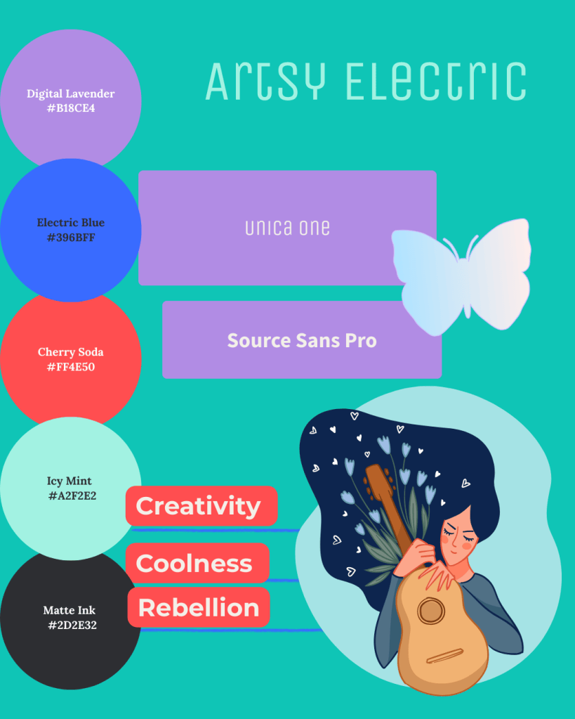
- Mood & Feel: Calm, stable, approachable
- Ideal For: Coaches, wellness brands, consultants
- Use: Convey reliability and trustworthiness
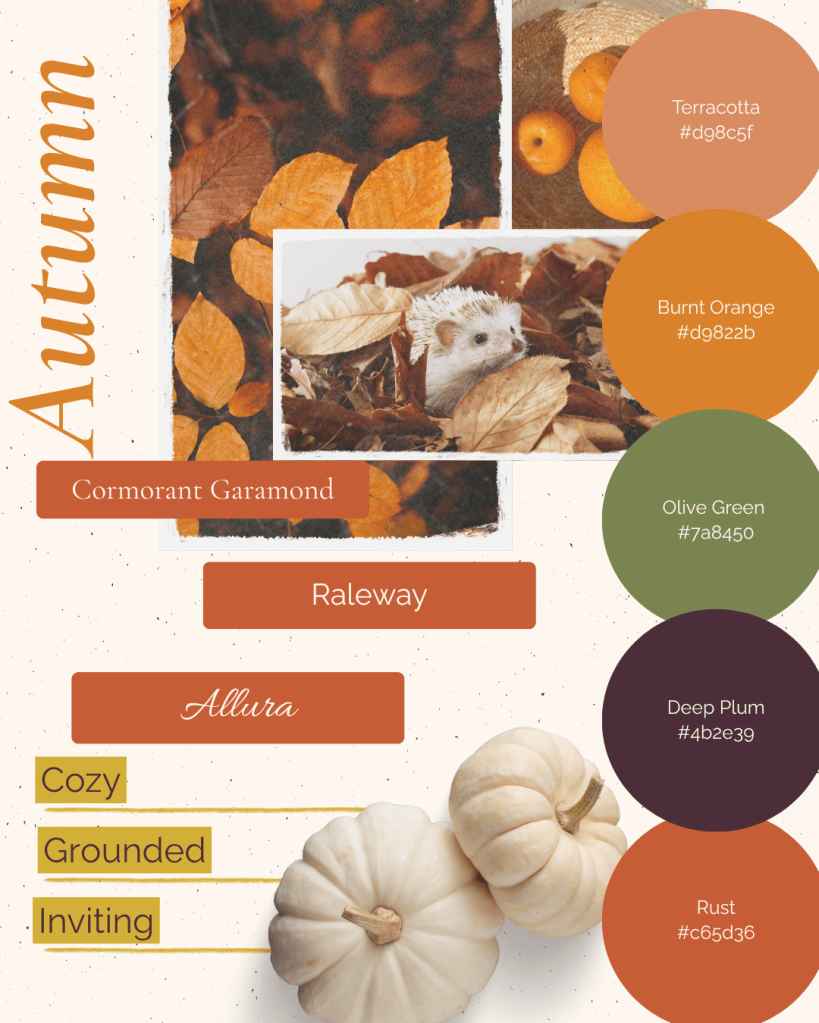
- Mood & Feel: Cozy, grounded, inviting
- Ideal For: Lifestyle brands or seasonal campaigns
- Use: Create warmth and familiarity in your visuals
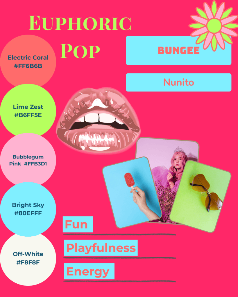
- Mood & Feel: Energetic, creative, memorable
- Ideal For: Creative agencies and small businesses wanting to stand out
- Use: Make a bold impression and express personality
You might also enjoy these posts:
- How Bold Colours Can Help You Stand Out
- Design Your Brand Personality with Joyful & Grounded Mood Boards
- Make Your Brand Look and Feel Aligned
Practical Tips for Applying Your Palette
Consistency is key: Apply your palette across social media, website, marketing materials, and products to create a cohesive brand experience.
Use hierarchy: Let base colours dominate and accent colours draw attention to important elements.
Document your choices: Keep a simple style guide with HEX codes, fonts, and usage examples to maintain consistency over time.
Bringing It All Together
At Simatrix Digital Studio, we can help you translate your brand personality into a visual identity that feels intentional and cohesive.
Our Etsy store offers editable mood board kits and social media template packs designed to make colour psychology actionable for your brand. You can also request a custom mood board for a fully tailored palette.
When you understand your brand vibe and use colour psychology intentionally, your visuals will not only look professional.
They’ll communicate your values, attract your ideal clients, and make your brand feel unmistakably you.
Want help finding a colour palette that’s unmistakably yours? Visit the Simatrix Digital Studios website to see how we can help.
