Design Your Brand Personality with Joyful and Grounded Mood Boards
Colours and visuals do more than catch the eye. Simply put, they show your brand’s personality and values before a single word is read.
Joyful and grounded mood boards are perfect for coaches, creatives, and small business owners who want a brand that feels uplifting and reliable. Below, we break down three mood boards, what they communicate, and how to bring them to life.
Why Joyful & Grounded Mood Boards Work
Grounded colours communicate stability, trust, and care.
They show your audience that your brand is dependable and authentic.
Joyful tones bring energy, warmth, and approachability.
They make your brand feel friendly and uplifting without overwhelming the viewer.
Blending the two creates balance: your brand feels vibrant yet trustworthy, creative yet consistent.
How to Apply These Mood Boards
1. Start with Your Core Values
Decide what emotions you want your brand to evoke (calm reassurance, uplifting optimism, or both).
2. Build Your Palette Thoughtfully
Layer joyful accent colours over your grounded base palette to add depth, warmth, and personality.
3. Keep Your Brand Consistent
Apply your palette across social media, website, marketing materials, and products. Consistency makes your brand instantly recognisable.
You might also enjoy these posts:
Mood Board Ideas
Joyful & Grounded
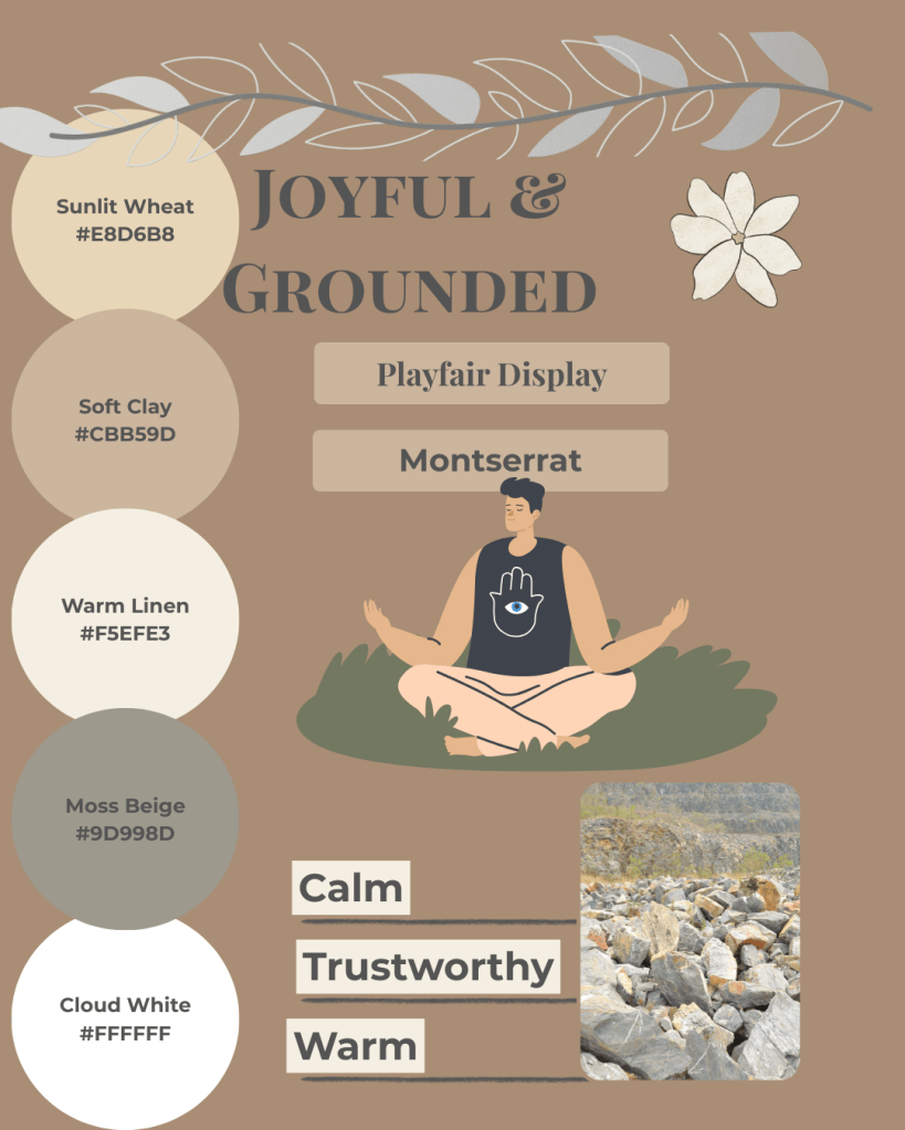
- Soft neutrals + gentle earthy tones
- Lighter shades for backgrounds/layouts
- Deeper shades for accents (buttons, headers)
- Creates an approachable, credible vibe
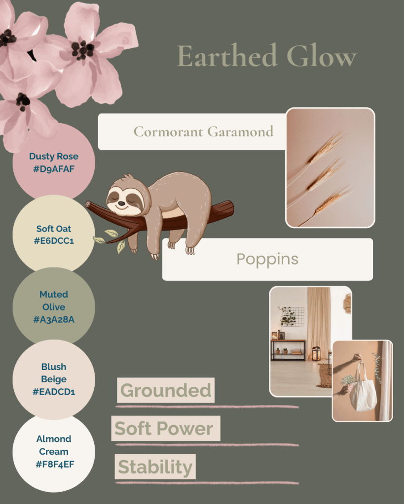
- Muted greens + blush tones
- Highlights products or services subtly
- Adds warmth and reliability to your brand
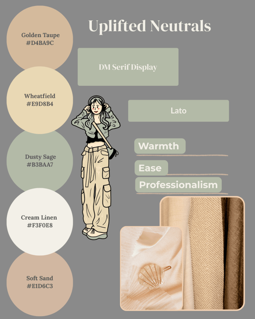
- Soft, approachable tones
- Perfect for social media graphics and website elements
- Maintains readability and calm energy
Bringing It All Together
At Simatrix Digital Studio, we can create a custom mood board for your brand, or you can use our editable templates and social media kits on Etsy to bring these palettes to life yourself.
A brand that’s both joyful and grounded creates a welcoming space that attracts clients who value authenticity, positivity, and connection.
Want help building a mood board that feels like you? Visit the Simatrix Digital Studios website to see how we can help.
