How Calm Colours Can Help Your Brand Build Trust
Your brand’s colours do more than make things look pretty. They send a message and create feelings long before anyone reads your words.
For coaches, creatives, and small business owners, picking the right colours is a subtle but powerful way to build trust and leave a lasting impression.
Soft, calming colours help your brand feel reliable, approachable, and warm. Here’s how to use them so your audience feels confident and connected with your business.
Here’s how to use colour theory to your advantage:
Understanding Calming Colours
Calming colours are soft, muted, and soothing.
Blues, gentle greens, warm neutrals, and pastels fall into this category.
They’re linked to feelings of peace, stability, and reassurance (all of which naturally build trust).
Examples:
- Blue: Feels clear, professional, and calm. Great for brands that want to show reliability.
- Soft greens: Suggest growth, balance, and renewal. Perfect for wellness or eco-focused businesses.
- Warm neutrals: Beige, cream, or taupe give a grounded, nurturing feeling.
- Pastels: Gentle, approachable, and creative vibes.
While these meanings aren’t universal, choosing calming colours thoughtfully makes your brand feel welcoming and trustworthy.
Why Calming Colours Matter for Your Brand
Early on, your brand needs to show that it’s consistent and caring.
Calming colours do this quietly in the background.
They can:
- Reduce anxiety for new clients who don’t yet know you
- Show professionalism without feeling cold
- Support messaging that emphasizes connection and support
A soft palette invites people to engage with confidence.
How to Choose and Apply Calming Colours
1. Start With Your Brand Personality
Think about which calming tones match your brand’s style and values. A wellness coach might choose soft greens and lavender, while a consulting service might prefer dusty blues and warm greys.
2. Build a Balanced Palette
Mix your main calming colours with accent colours for contrast and interest. Too much softness can feel bland; accents keep your brand visually appealing while staying harmonious.
3. Be Consistent Across All Touchpoints
Use your palette consistently in your logo, website, social media, and marketing materials. Consistency makes your brand recognisable and strengthens your presence.
Calming Mood Boards
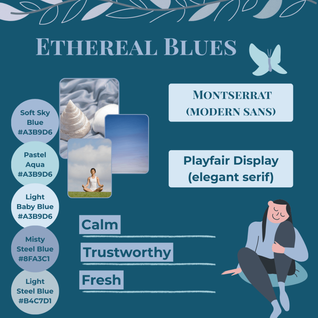
- Soft, muted blues create a calm and trustworthy vibe
- Light shades perfect for backgrounds, deeper blues for accents
- Ideal for brands that want a fresh, approachable look
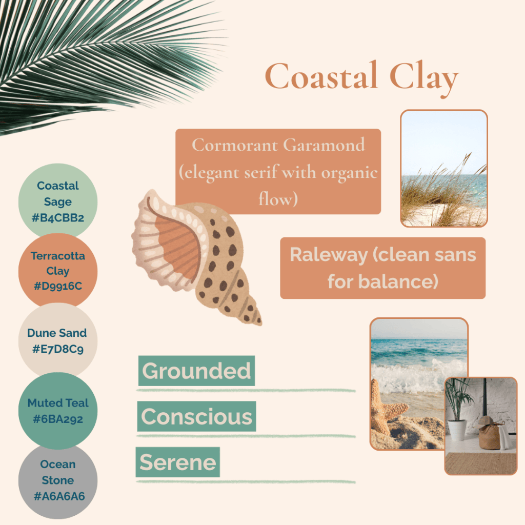
- Earthy tones evoke stability, mindfulness, and warmth
- Muted accents highlight products or services subtly
- Works beautifully for grounded, approachable brands
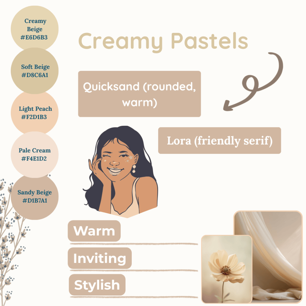
- Soft neutrals and pastels feel warm and welcoming
- Perfect for creating inviting social media graphics or web layouts
- Stylish, approachable palette for creative and service-based brands
You might also enjoy these posts:
Bring Your Calming Palette to Life
Mood boards are a great way to see how your colours, fonts, and imagery work together before finalising your brand palette. They give you confidence in your choices and help you visualise the emotional tone of your brand.
At Simatrix Digital Studio, we offer calming mood board kits designed to guide you through this process. Each kit includes thoughtfully chosen colours and visuals to inspire your unique brand look and feel.
With a calming colour palette, your brand doesn’t just look professional; it feels welcoming, trustworthy, and unmistakably you.
Want more support choosing a colour palette your audience can trust? Visit the Simatrix Digital Studios website to see how we can help.
